




Pipsqueak! Key art and logo design
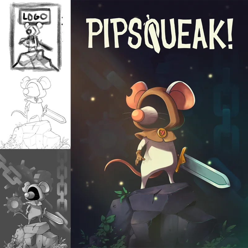
Hey folks so the art I did for this really rad looking indie game was revealed finally so I thought I would share it here for those interested. This was a really fun project that came my way basically right as the new year started and had a pretty quick turnaround. All told I think it was maybe a couple weeks on and off to get to final. Anyways it was great and I'm super excited for more folks to see it. Below I'll share a simple process breakdown image as well as my initial page of scribbles and notes when I was first contacted by Dan about the project.
When I was approached it was stressed we had a limited time as well as budget so I had to think a bit smarter with how we spent those resources. You can see that hinted a bit here in my note document. An interesting thing about doing work for a lot of the indies I have is that the one piece of art usually needs to be able to work in various formats for all the different digital storefronts or bits like on Steam etc. So I try to keep that in mind and lay out how things could potentially work out. Also this means when I am actually making the finished art as many pieces as possible need to be handled independently. So for this illustration the Mouse, the base rocks and the chains and gears are all modular so could be moved around to better suit the format the art will be used in if needed.
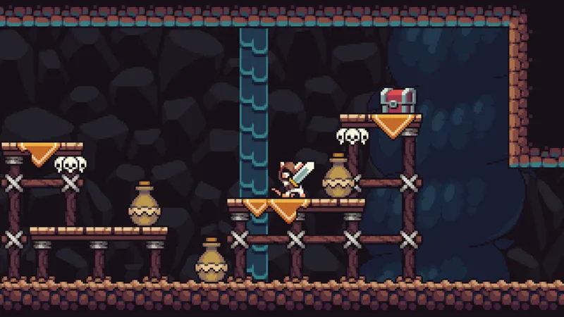
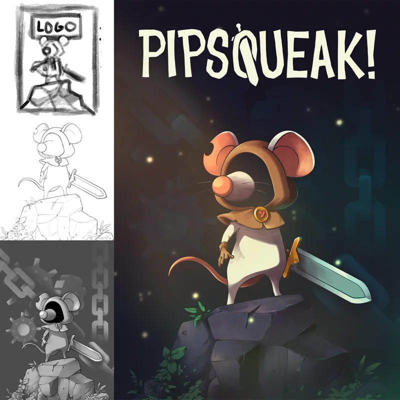
This image is just a pretty simple breakdown of my check ins with Dan as I worked. It was super easy working with him and he let me sort of just do my thing for the most part but would suggest small tweaks here and there to make sure the character was as in line as possible with what he had created. It was interesting working off of a character design that was already made but made as a small sprite so simple shapes and not everything nailed down. So I basically took the sprite and built out a character design from that. As you can see the sprite for having minimal detail conveys the character really well. I wanted to do my best to maintain that spirit and just add a bit of visual interest and detail where I felt it would work most effectively.
As for the logo, that came together pretty easily actually. Dan had sighted some other games we both loved like Death's Door and Hollow Knight and really wanted to try and get something for this that worked strongly with just a single color like those games did. I completely agreed as personally I love working with just one or two colors when making my logos so I dove into it. We had the art proper done at this point so I just sketched out what we ended up going with pretty quickly. I noodled a while about how best to implement something with negative space and iniitally was trying to work more of a mouse shape in but quickly decided to instead use the sword shape in a fun way to break up the Q which was our center point in the title and also I think helped balance it all out. In the end I am super happy with how everything turned out and very thankful to Dan for the opportunity. If you'd like to see a hyper condensed 30 second timelapse of the art process I have posted a video on my twitter here and if this seems like a game you'd be into you can sign up to be notified of the Kickstarters launch here. Thanks y'all and as always, be good to each other!
- Teeg
Comments (4)
this looks amazing thanks for sharing even design tips
Thanks! Happy to share what I can. I’ll try to do more of these types of posts when I have time.
This came out so dope!
Thanks dude!