





Hey, I made a game!
UPDATE: So after playing a round at a real life, physical table I had the idea that standees would be fun and not only fun, helpful! As you can read throughout the post I wanted the design to be nice but also functional so with the standees it would very clearly help folks at the table know who's turn it is and who they've chosen to duel.
Hey folks, as some of you may remember I was designing a card and dice game. We ran some playtests online and all had some fun. Anyways I had been putting the finishing touches on some things and decided to get a mock up done and order a physical (test) version of it and I thought it may be interesting to some to see a bit of the design stuff. So let's take a look!
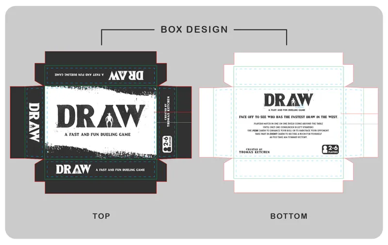
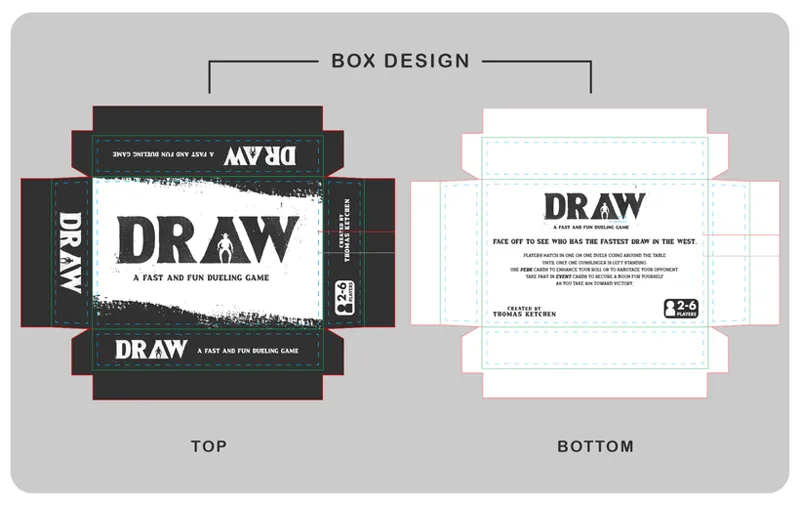
So first we have the box design which was actually the last thing I did. I wasn't sure what I wanted to do here but in the end went with something minimal and clean to match the design base I had already established first with the cards as you'll see and then through the instruction pamphlet.
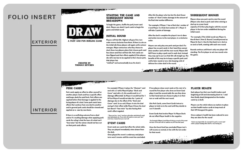
Next is the previously mentioned instructions. I was initially planning on just doing a normal poker sized card deck box so designed the instructions to work on a double sided, 4 fold pamphlet. I kept it despite moving to a different box because like with all of this it's a test to just get a copy in hand so I didn't feel it important to change it.
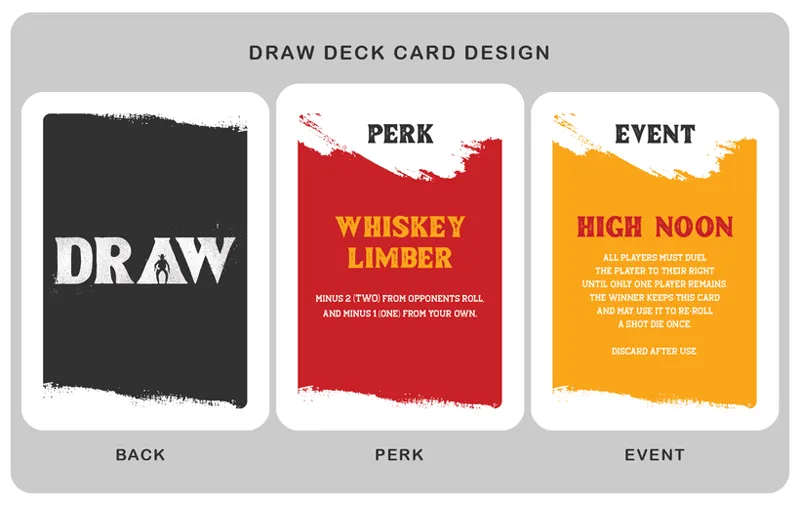
And now we have the main bit of the game, the cards! The game consists of perk and event cards and I wanted to use some bold colors to mark the different card types so even at a glance in your hand you could know which types you had.
And lastly there was the biggest stumbling block for me, the player health cards. These in theory would be used in conjunction with a small token to track your health as it fluxuated throughout a round but for this test I didn't get those made as it just wasn't super cost friendly and I wasn't happy with the currently available options. In the end I nixed the idea to have characters on these cards as I felt while a fun idea it didn't fit with the mentioned minimal design motif I had already established. I opted for a gradient to bring my card colors back in for a bit of uniformity but to also again be functional. Generally speaking folks know red is bad when dealing with health meter type of things. Games through the years have trained us as such so I thought this could be used here in seeing how you were fairing at a quick glance. Also for the other players around the table to quickly see where you may be at health-wise without needed to know the exact number.
Anyways that is it for this and again this is for a test so I'm sure there are probably typos/misspellings and other stuff in here but it is what it is. I'm excited to actually get it in hand and see if my mock ups translated alright to actual physical game pieces. Thanks as always for the support and until next time, be good to each other.
- Teeg
Comments (1)
Hell yeah! Excited to see how the product looks in physical form