

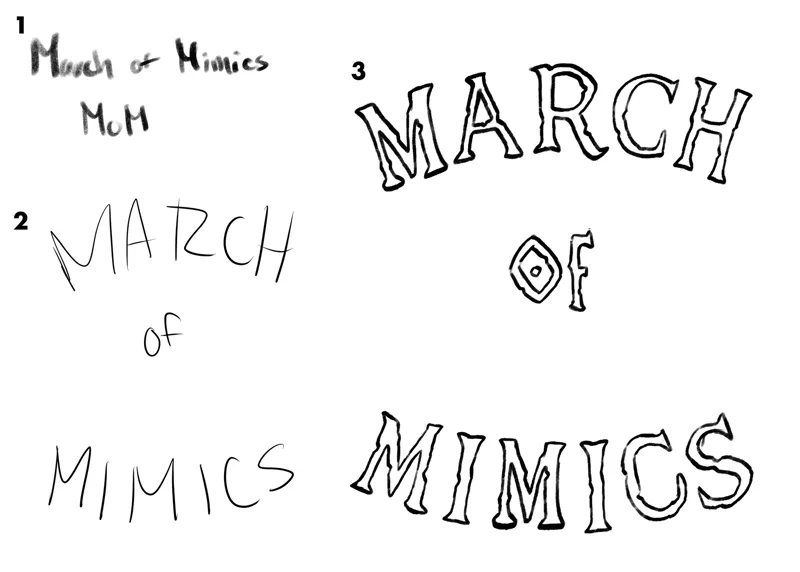


March of Mimics (logo process)
Hey y'all,
so I am here today with a little logo process walkthrough/tutorial. But before I get to that I should explain what this actually is haha.
So, March of Mimics or MoM is a monthly art challenge we're cooking up on the discord (currently taking prompt suggestions to get a daily list together) The goal is to have a fun time doodling all sorts of wild mimics throughout the month of march. Why? Just because! And also we haven't done a community art challenge in a while so I think it's a nice time to kick something off. And for me personally I'll most likely collect the mimics I do throughout the month and maybe put a little zine/PDF together at the end of it all with some process stuff and little notes about them, should be fun!
Now on to the tutorial part of this, I thought it may be interesting to walk folks through my process of how I came to the final logo here.
Firstly I started with general text and you can see the layout and style evolve to what it would be in the final from spots 1-3 of the first numbered image. My thoughts here were trying to find a layout that would allow for the icon image of the mimic to be centered. I knew a composition that was more vertical/rectangular would work best for what I wanted so I had that in mind as I was constructing the text. In terms of the actual letterforms and their style I wanted to maintain a hand drawn aspect of it so I didn't worry about cleaning them up and making the letters all uniform. I actually stuck with a pencil brush as well so the edges stayed chunky. Once I had the letters in I duplicated that layer a few time to harden my edges but keep the scruffiness of them and then filled them black to have a solid. Once I had my text down I wanted to finalize my icon.
So secondly the icon. I had roughed out a mimic even before getting my final text in, but initially it was going to be a fully detailed drawing and the text would surround it. But shortly after starting I realized I didn't want that. I want that stark icon. Something that would be recognizable but also could remain simplified. As you can see in the second numbered image here I started with a rough which nailed my pose pretty early on and I just worked from that eventually realizing I had to tweak some of the hand/arm positions to make the whole thing just more readable as a silhouette.
Third as you can see the vertical layout I mentioned earlier. I also wanted a few color options as well just to make sure not only that the single color logo (both with text and just the icon) would work on light and dark backgrounds but that because of it's nature it would be recognizable at a distance, even if you can't perfectly make out the words you'd know what was being presented.
Lastly, I wanted to create an alternative, landscape format for the logo with the text. I think it's good to have this as it shows your icon is versatile. Also having alternate layouts allows you to work the logo into multiple formats. So having that "header" style allows me to remain true to the logo and it's vibe without having to sacrifice anything for sake of what it will be placed on.
So there you have it, I hope that was informative for you and interesting to some. I will have another post a day or so before March starts with the prompt list for those who'd like to not only participate but follow along with the prompts. Thanks folks!
- Teeg