
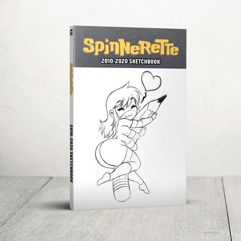

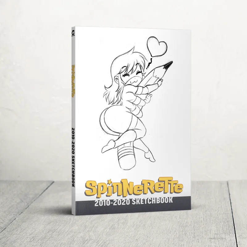
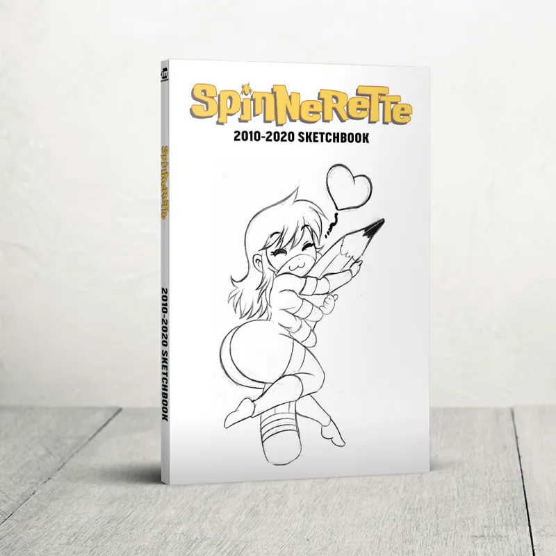
Sketchbook mock-ups!
Comments (15)
Thanks guys! #2 it is!
Title at top. Many shops will put you on tiered shelving and only your top content will be visible. So that region has to be able to grab attention just as much as the full cover. FWIW i like #2 but with the bottom bar the same shade as the top bar.
Exactly my thoughts: I was about to post - #2 with bottom bar same shade as top bar.
I'm all over on this one, I kinda like the family resemblance of title on top, but it kinda works on the bottom.
A general question - will there be no digital tiers for this? I'd rather want to have both books in PDF form than printed...
Maybe you should make a poll, I’d vote for the second or third one though, the title looks interesting at the bottom as well!
2nd one with the black bars on top and below.
I would go with the second one.
I like 2 the best.
I like the fourth one. Looks very clean and sharp.
2 please
I'm liking the 2nd personally (with the black bar on the bottom)
Fourth. Bob Burden (Mystery Men, Flaming Carrot) taught me that a simple white cover has an impact that is just lessened by adding clutter.
3 is my winner
I'm liking the 2nd one the most.