
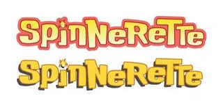
More logos!
I think we're going to go with one of these, what are your thoughts?
Comments (7)
The second one looks best to me.
I prefer the second (Drop shadow version)
Both look great, though I'm curious what a black/dark blue outline would look like. As it is, I prefer the drop shadow, imho.
i think that the upper one would look great with a smaller outline
(Can't reply to Krazy Krow's comment, so starting a new comment) - From a style standpoint, I do like the drop shadow. My only concern is the background placed behind it. Depending on what the scene is, the drop shadow could be too difficult to see.
I like the contrast offered by the lower option, plus the colors are close to what Spinnerette actually wears.
We could tweak the colors on either... do you think the drop shadow looks better than the outline?