
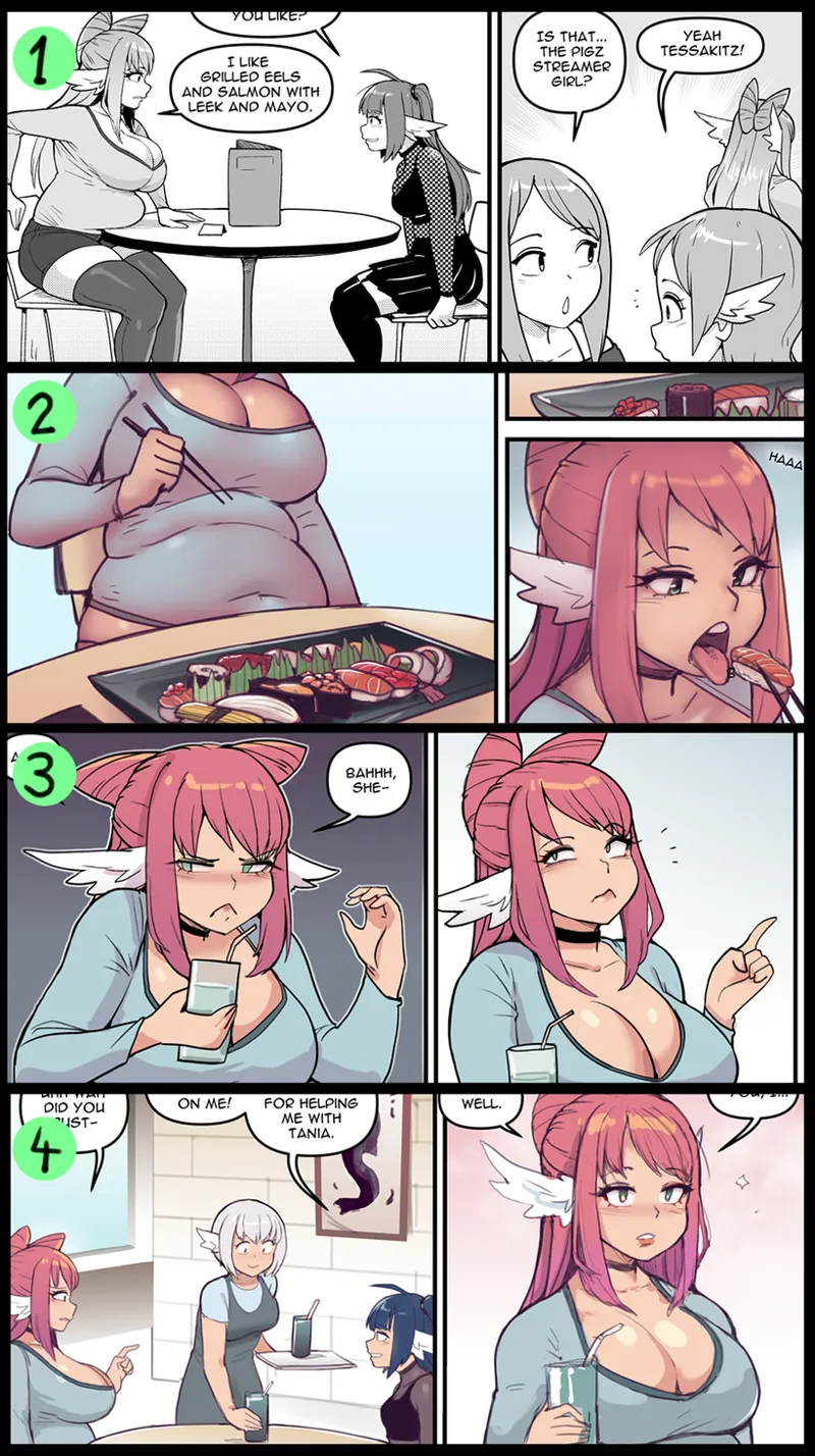
Comic Syle Poll
Again I want to emphasize that this poll will not decide what style I will do the comic in. I just want to know what kind of style you like the best so I can use that in deciding the future style.
Comments (34)
late to the party here, but 4 is my fav. looks super clean and professional. 3 seems a bit flat and 2 is a lil too dark and blended, if that makes sense. although you can't go wrong with the original style of 1. i'd say go with whichever takes the least amount of effort/time between 1 and 4. whatever u decide, love ur work!
2 is my favourite, 1 is next fav. 2 I think has the best definition on curves and cleavage. 1 2nd because I'll always love manga style.
1 and 3 for me. 2 looks too dark and doesn't highlight the lines. 3 looks clean
Should've had the same panels for each one. I think people are voting for the subject matter lol
Honestly, they all are pretty good. I really dig two though; bit sick of seeing that type of coloring in the full pieces (no hate, I will always appreciate them) but I really like the coloring in the page you did it in but when you did it for the beach, fan service comic, I was not a fan. Too many colors then but it really works well here :D
1, i've always loved the black and white manga feel of your work, that being said it looks like 2 will win which is fair, its the cleanest of the colorings not that any of them aren't good. Id be happy with any of em tbh
Additionally — ALL new proposed styles fared better than the already well-liked grayscale manga look. In other words i think kip can’t go wrong and should just do what is most fun 😎
Ok airbrush shading (2) is at 46%. BUT both 3 and 4 have very similar (cel-style?) shading, which means a combined 41% voted for this style of shading — split over the lines style (sketchy or manga inks). Not so far behind really!
I pick option 5. Do not care :)
I like all the color options but something about #3 really stands out
1 and 3 are defs my fav
I like the softness of four, but I love the warmth of two
Your comic looks great in all forms. I love b&w for the smutty tummies but 2 is otherwise my fave.
Honestly the black and white just works best for me I can’t explain why
My favorite is rough lined 4 (although it’s close with crisp manga lined 3). 4 has so much character and expression! Being softer in places, the lines join with the colors. There are intriguing details like the red on the lines around part of tessa’s eyes. In general the hue shifts in the shadows and highlights seem to be pushed a bit more. Basically it looks most fresh, alive and expressive, which is what i like.
3 is sketched and then Inked like the black and white. Instead of grayscale it has flat colors and simple cell shading. 4 Is sketch without inking colored with a combination of simple shading and some soft details
That said these results are rough for me because airbrushed 2 is the only one that clearly stands behind the others for me. I’m struggling to explain why. The airbrushing does give a dusky mysterious vibe which is interesting. But i think having soft gradients everywhere is just kinda less appealing to my eye; in contrast i love the clarity and specificity of all the others. In those, a shading region has a definite shape and character. To me that feels more alive.
I'm with you; 2 is landsliding but it's my least favorite of the lot!
I understand the intent of the poll but want to stress that all of these look great to me and would make zero difference in my anticipation of every new page or my patron status. I support this patreon because i want kip to be independent to make their own authentic artistic choices that satisfy them and keep them motivated and content as can be for a creative person.
Number 2s shading seems on point to me with it's painting like shading, the others seem too flat or bright to me still love 1 though for it's definition
The black and white is the original and will always be my favourite, But when it comes to the colors it is 2 for me! :)
I would say 3, it's the most similar style to your traditionnal black and white work, but featuring colors=) Also style 3 seems to be essentially flat colors and simple shades and light effect (maybe I'm wrong) so it's a game changer for the time spend on your panels and pages I'd say keep it simple for your comics and go wild on your paintings as you always did Kip=D
1 and 3
1 and 2. I've always liked the black and white, but panel 2 looks a lot more like a style that matches a lot of your other work that I like!
1 because I know the others are a lot more work
Honestly I’m split between 2 and 3. 2 is very pretty and really adds a lot of depth to the characters, but there’s something simple and clean about 3 that just “works”
I love the shading of 2 though I think the colours are maybe made a bit to warm. 4 has the colours perfect and would be my second pick. But if adding colour adds too much to the workload than the 1 still looks great in my books.
Also I think the tummy in 2 is skewing the numbers haha
I’m curious about the relative time to make each style. 2 is nice, but it looks like you’ll be killing yourself 3 days a week.
2 for colors but I really enjoy the blank and white too
#2 seems too shaded (doesn’t quite match the linework) and #4 seems not shaded enough. #3 is perfect goldilocks coloring for me. Of course #1 should be used as needed to minimize burnout ;)
2 and 3 are both quite nice, but honestly I'm just thinking about sustainability on your end. Whatever treats your hands and time the best, Kip!!
For me only 3 looks too much like comic for kids and I don't like it
3 got some swag to it