
May 9, 2018
GUI changes - Feedback is welcome
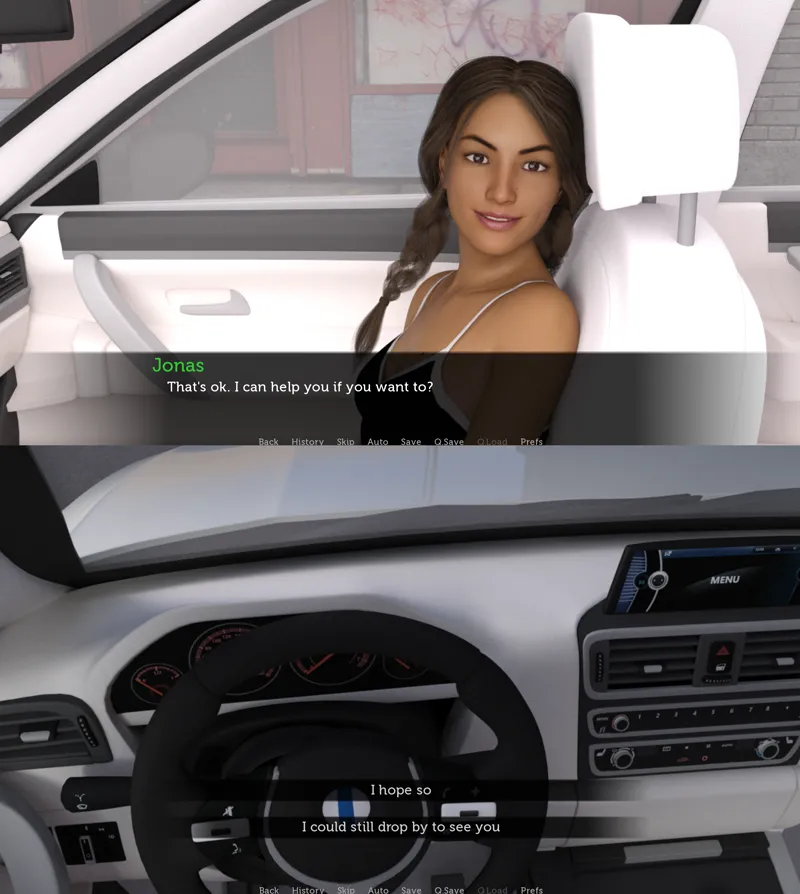
The script for Episode 2 is finished. While I wait for renders and animations to complete I have worked a bit on the GUI elements in the game.
- The font is new
- The textbox is 17% lower to allow for more of the image to be seen
- The alignment of the choices is now at the bottom of the screen. This way the choices won't cover any character's face.
Any thoughts on this? I just want to make sure that you don't find the design or font annoying.
Cheers!
Comments (2)
S
Socrates · May 9, 2018
Looks good to me as well. I like the choices at the bottom.
R
RødTop · May 9, 2018
The textbox looks good no problem there