


Reminder and a Poll!
Hey, folks! I wanted to remind you all there's no mid-month update due to medical stuff with the husband! (We have 3 appointments coming up back to back here shortly. Time for his second cataract surgery. The first one has proven to have had a great impact on his vision already, and I'm excited for the second one to be done too so he can properly see again.
--------------------------------------------------------------------
Now, for the poll!
I asked folks on Discord how they feel, but after seeing the poll results, I wanted to post it again here and add some extra screenshots and context to go along with it.
The poll was regarding side images.
For ExcA, I use a side portrait for important characters when they are talking but have no image displayed on screen. I've seen some projects use a side image for their characters all the time, and I wanted to see how people felt about that.
After seeing it in action myself, I personally prefer NOT having the side image displayed at all times. It's just a duplicate of the image already on screen, and it kind of feels cluttered to me. I'll post some ExcA screenshots below, then a mockup for the next project too.
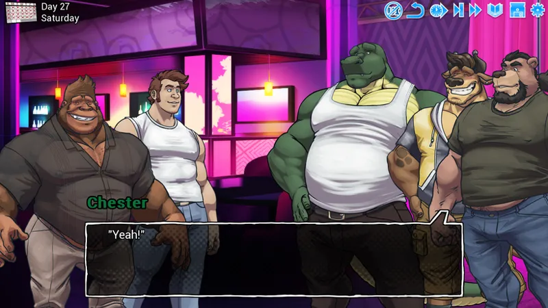
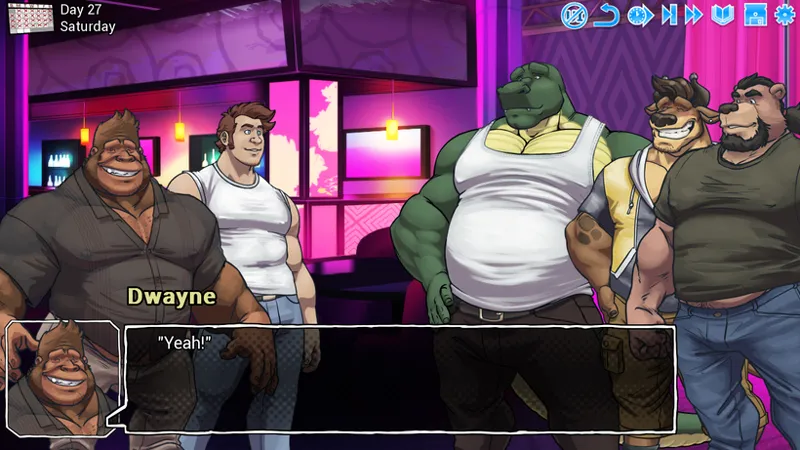
I know you've all seen this as an error at some point or another, but this is with the portraits on the side off/on depending on the character being on screen.
Now, I know some folks think "There's more man on screen, so it's better!", right? But it feels cluttered now, and we're duplicating something we already see.
On top of that, there's a change that good stuff gets hidden behind those portraits!
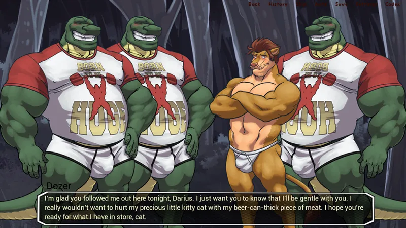
The following screenshots are mockups for the future project to show off some ideas.
Some variety here!
With and without the portrait, then one with a shorter, wider text box. Surely you can see the benefit to that one.
Personally, my favorite layout is the first image. It just feels the most balanced to me!
I'd like to get more feedback on the matter though, so let me know how you feel about it all.
Of course, I won't be using the same dialog box either. I'll have a new one, and the name will probably have a box too (along with colored text to denote who's talking).
Examples to explain your thoughts or why you prefer a certain one is welcomed too!
Thanks for your time, folks! (And please don't take offense if I don't reply to EVERY comment! I'll read them all, but sometimes it's hard to reply to them all on topics like this)
Comments (42)
If there's just e.g. MC and another character, that's cool without individual portraits. But if there's more than one, it feels clearer if a portrait is included, if that makes sense. Either way, keep up the fantastic work and bests to hubby.
I understand what you're saying! And thank you!
I think on a one-on-one conversation, no portrait is totally fine. Like if the only character on screen is the one speaking - and it's clear what lines are spoken by our own character - cool. The moment there's more than one character on screen, especially since with updates being monthly, I tend to forget who is who... and I feel like portraits are kind of needed? 'Dozer' really doesn't mean anything to me if I can't recall who that is. Easily fixed by going back, maybe, but not having to do that would be nice, IMO. Knowing who is who at a glance is useful.
Hah, that's a fair point to make!
I like how it is currently. I don't need any extra heads floating around if the character is on screen already. Also the face portrait looks better for me, than the half body image in the second picture and if half the body is already there, he could've been on the screen anyway.
Three, bc those thighs
If the expressions match, then I say drop the portraits. Although, sometimes a portrait displays an expression that is different from the expression in the main image. Ive enjoyed the dimension that adds. But maybe the effect could be achieved another way
Something something AO3 writing curse
i feel like you should keep the rule of no portrait if the character is already on screen but i like the portrait style of image 2... maybe you could keep the rule and if a character is off screen use a portrait in image 2 style so that the screen is not cluttered
I see! Combo of them... I haven't fully decided just how I want to handle the portraits yet, but I'll keep that in mind!
I like version 3 the most. Would be even better if the textbox and font could be scalable to some degree - for all the people having trouble seeing small texts or just like to lean themselves back while reading (like me 😁). As for the clutter-problem: I've seen some other VNs that have a custom text box for all the key characters - like 'Lyre' VN. Or you could simply solve the problem entirely with a small colour coded headline at the top with the speakers name: Coach - orange Dwayne - brown Rando/NPC - 'XYZ' in white MC - 'You' in white Just some thoughts 🤔😁
I'm definitely gonna keep the color-coded names for the future! I like that too much
When the character who speaks is on the screen then the side portrait isn't really necessary. When the character is not on screen however then I'll gladly take the portrait. However, this can probably be incredibly tedious to code I guess, so in general I'm fine with no side portraits.
It's not too bad when I plan for it!
I like seeing who is talking. The thin text box is great for images but the heart of vns is in the text. You can also have one character on screen whilst the other is in another room or further away and have them still talk and see their expressions. For instance doing tennis you can zoom in one players serve and the text image shows the opponent reaction. Or zoom in a face for an emotional reaction moment and use the little face text image for the person saying the words
HAha, for tennis stuff, that would be neat! All of this stuff is just research for the next project though ;3
Image 3, and keep the name colors on who's talking. I like that the best.
The colors will be a must!
I prefer how you have it currently.
I like to hear that!
(Also, great to hear big lion bro doing better, ans wish him the next appointment goes equally if not better from the last one 😊🫂)
Honestly, I prefer the first version, as things were all together. More big bara men is always good, for sure, but for this game, I believe the main design is what feels the best, and works the best too. Plus, to give a small personal take I have from playing various games over the years, the extra image of who is talking does not fit well when it comes to VNs. I mean, we have the main cast on the screen for that reason. The small image box could definitely work too, but mainly I do believe it works with rpg based games, similar in gameplay like FF 2d titles, paper Mario, etc. I would highly suggest to go with your gut at the end, though, and add the style you prefer the most. As for my take, yeah, I stick with what I said and do believe the original designs you had there fit the best.
The most I think about it, the more I question why I thought to ask this, haha. I like how ExcA is handled as it is, so with the future project, I might stick to the tried and true formula
I like 3, but maybe with a small bust in the corner of the guy speaking. I always enjoy the corner portraits
You're gut reaction is the best option. It's too cluttered otherwise. If you had static images as the default, then I could see the side images being a benefit for displaying the emotions tied to the dialogue.
Good to hear!
Just as a suggestion. Why not instead of a full image of the character you make a little chibi head version of the character speaking? You can scoot the name over to the right a little and put the head there. Would be less clutter on screen and still show who speaking.
That's a thought to keep in mind!
side image feels too cluttered, I'm fine with either 1 or 3
Understood!
3! SHORTER TEXT BOX! PLEASE!
For obvious reasons!
I think with the cluttering problem, the answer could be just having the head, or maybe a small icon, similar to the photos they have when they are texting each other. The safest options remains the number one tho
It could! Just a small head portrait, like how it's mostly done in ExcA, would maybe work better than just a smaller version of the full sprite
I think the always side image only makes sense if the character's expressions don't change in the main image. Then the artist can just have a couple face only images with different expressions and use them in the side image to give the player the idea of how the character looks when they're speaking.
Mmm, I see what you mean! The side images is really just the same images as on screen, so it'll reflect whatever the main image shows!
I like image 2, feels like I’m playing a jrpg like persona and such
I could see the appeal there!
No image needed and lower text means more to look at but that's just my opinion
See, you get it, haha
Having the sprite by the text box while the full character sprite is also on-screen just feels too busy and a bit confusing for me. Definitely a “less is more” thing for me
Also my thoughts!