
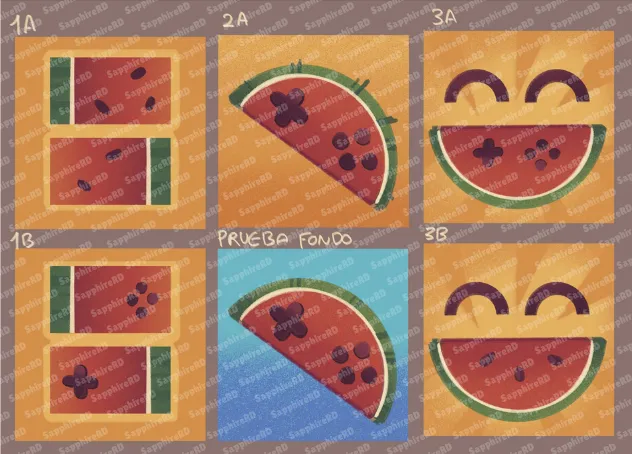
Help me choose the new WatermelonDS logo!
Help me choose the new WatermelonDS logo!
Hi everyone!
Now that the project has officially moved from melonDualDS to WatermelonDS, I also want to finalize one of the most important parts of the new identity:
the new logo.
My artist has been working on several logo concepts, and before I make the final choice, I’d really like to hear what you think:
This post is public because I want to hear opinions from everyone, but I also want to mention something important:
Paid Patrons will have a little more weight in the final decision, as a small benefit for directly supporting the project. That does not mean public opinions do not matter. They absolutely do and will be part of the decision.
What I am looking for
I want the new WatermelonDS logo to feel:
Clean
Recognizable
Fun
Easy to identify at a small size
Good as an app icon
Good and strong as a project identity
Visually connected to the WatermelonDS name
Some concepts are more playful, some are more minimal, and some are more expressive.
What kind of feedback helps most?
If possible, I would especially love feedback about:
Which logo looks best at a glance
Which one would be easiest to recognize on a handheld or phone screen
Which one feels more polished
Which one feels more unique
Which one best represents WatermelonDS
Final note:
This is not necessarily a pure popularity contest. I will also consider readability, usability, and how well the logo works as a real app icon.But your feedback will absolutely help me make the final choice.Thank you all for helping shape the identity of WatermelonDS.
I am really excited to finally give the project its own visual identity!!
- Sapphire 💙
Comments (18)
Fix the sound on snapdragon 8 elite pleas....
yup!, new beta for patrons commig soon!!!
Hi! I found what causes the crackling audio in WatermelonDS and fixed it. It's tested on an AYN Thor and the sound is now clean in every game. GitHub doesn't let me open pull requests on your repos, so the fix is on my forks for now: - https://github.com/jojodogm-ctrl/WatermelonDS/tree/audio-rate-control - https://github.com/jojodogm-ctrl/melonDS-android-lib/tree/audio-fifo-size If you want to talk about it, add me on Discord: closs Thanks for the emulator!
Hiii!!!, yup please add me on Discord huesos_96
1B, but make the bottom screen a bit smaller than the upper one so it resembles the nds logo more❤️
Thanks, for your comment!
Maybe 1B on a the gradient blue. The contrast between would be cool
Thanks, for your comment!
2B - the blue background is refreshing and reminds me of Water 💦
Thanks, for your comment!
I like blue color so there is one and it looks nice :D
Thanks, for your comment!
2A esta bonito pero no dice que es un emu de ds Mientras que 1B lo deja mas claro (+/-) con eso de las 2 pantallas
gracias si me gusta, pero creo que si el 1B parece mas consola
2 and 3 don't really say "ds" to me. 1 has the right shape, but the way the buttons are on the top half in 1b is a little odd, but 1a is a little plain on its own, too. maybe something like 1a but with a stylus cutout so it looks like a design on the back of a ds? could work as a basis for a logo for seedlessds too
i think its mostly just the buttons on 1b throwing me off, maybe a design with just the dpad would work better
Another icon change? Like it's your app and everything, but this much rebranding and design changes are just going to push people away from you.
Hahaha, thanks for the opinion! It is just the app icon; the actual one is just a placeholder. I promise this will be the last change; others will be QOL for the actual design!