
[Behind the Scenes] Creating a background image
Hey there!
We were thinking it might be nice to give you a little bit of insight into how we create some parts of the game. Not because we are pretending to be masters of the craft, but because showing the process can be fun too.
And hey, why not, right?
Today, let’s talk a bit about background images.
Our process for creating backgrounds has already gone through a few revisions. Lately, we have been trying to find the best balance between quality, consistency, and the amount of time each background takes. Because as much as we would love to spend forever polishing every single chair, tree, window, leaf, brick, cloud, suspiciously perfect flower pot… we also need to actually finish the game. 😄
For Chapter 1, our workflow was mostly based on local image generation models. We used ChatGPT image creation mainly to create a reference image, often something close to line art, because it handles geometry and general composition pretty well.
That reference would then be imported into our most-used tool, Krita, where we used it as a base for creating the final background with our chosen model.
It worked.
Was it perfect? Not really.
Was it usable? Absolutely.
But lately, we have been letting ChatGPT do more of the heavy lifting. When prompted well, it can produce very solid results and save quite a lot of time.
For example, while creating the Birchfall University scene, we created a dedicated ChatGPT project and fed it as many reference images as possible. Mostly for style. We used our existing backgrounds as references so the new location would stay somewhat consistent with the overall vibe and art direction of the game.
And honestly, one of the strongest parts of image generation through ChatGPT is the prompting itself.
You can describe things in normal language. Full sentences. Specific details. Mood. Lighting. Architecture. What feels wrong. What should be changed. What should stay. You can basically talk to it like a slightly confused but very talented intern who has seen too many paintings and still somehow understands what you mean.
With local models, prompting usually feels much more keyword-based. You stack tags, keep things generic enough for the model to understand, and hope the spell does not summon a fourth window where a door should be.
With ChatGPT, the process feels more conversational, which is pretty useful for backgrounds.
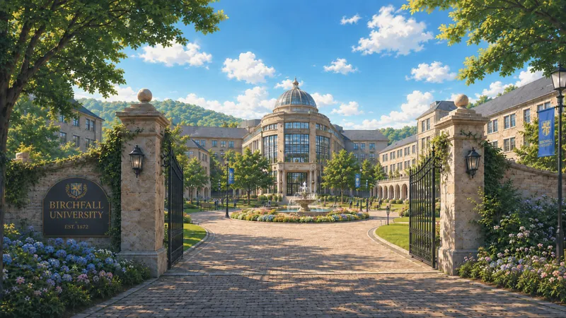
This was one of the later ChatGPT attempts for the Birchfall University background.
Pretty solid already, right?
In many cases, the result is almost ready to use. But for our taste, ChatGPT images can sometimes feel a bit too perfect. Too symmetrical. Too clean. Flowers repeating like a pattern. Leaves are placed as if they had one model copy pasted through the whole tree. Nature looking like it was organized by someone with a ruler and a mild obsession with balance.
That is where Krita + AI inpainting becomes really useful.
Having a strong base image is much easier than trying to build everything from scratch. So instead of fighting the whole image, we focus mostly on supporting elements:
Trees.
Flowers.
Sky.
Small, weird, illogical spots.
Anything that looks too artificial or too copy-pasted.
For buildings, symmetry is usually fine. A university building is supposed to look structured and intentional. But nature? Nature needs a bit of chaos. A little unevenness. Something that says, “yes, a tree actually grew here.”
After that, we usually do some color fine-tuning as well.
We try to tone the image down a little so it does not scream at the player. Backgrounds should support the scene, not wrestle the characters for attention. The characters need to remain readable on top of it, especially in a visual novel format, where the background is important but should not steal the whole stage.
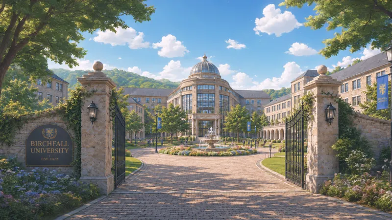
So after inpainting, cleaning up strange parts, adjusting nature elements, and balancing the colors a bit…
The result may look like this:
What do you think? The differences might be subtle on first look, but we believe that attention to detail, at least to some degree, is important.
Do you like seeing this kind of behind-the-scenes process, or would you rather we keep the wizardry hidden behind the curtain? 😄
Uploading both images as attachments for a possible closer look.
Comments (4)
When i first saw the ChatGPT image, I thought that it looked great. When I read what you write about it being "too perfect", I totally aggree. The small changes you have done to the image makes it look better by looking less perfect! I enjoyed the look into how you make the game, and hope that you will contine doing that.
Thanks! Small changes make the difference, even if they are not visible on first glance. Yeah, we will! I kinda assumed that people would not care about this stuff, but if they do, we can do some more insights.
The lightning seems off in both. Too white. Not much but " slightly". U know u got an inconsistency in fmc skin color? Jz I'm jumping, sry. Did u tried, since u are in europe to enhance,alter real photos? We got some pretty old places here, even universities, campus, even major building if altered enough could funtion in completely different ways, could be easier, if u got kids/ dogs combine it.😁
Yeah, the skin color fluctuates a bit; we are aware, yet it is mostly different scenes so it should not be so annoying, at least. We try to color grade it and fix it, or at least, stay in some relevant tone. When inpainting faces on an existing sprite, it struggles a bit; who knows, maybe we will find a better way in the future to handle that. As for the scene, the contrast is toned down on purpose, making it a bit faded/white-ish, so the characters on top of it are colorful and alive, and the background is not too saturated, eye-catching, so the lighting is "off" on purpose. As for the real locations, no, we are not doing that. If we can't get the "idea" we are looking for strictly from generation, we are using a Pinterest image or similar to get the reference, but not copying real locations.. or at least not on purpose.