
Poll question before releasing pop can tab opener(s)
The pop can tab opener has made it to the top of my to-do list, and I’m testing a few different directions.
There are already quite a few tab opener designs out there, and a lot of them do a great job of giving people a nice flat area for logos or customization. That definitely has value, especially for sellers doing branded items.
For this version, I’m trying to balance customization with size, function, and how naturally the opener engages the tab.
I still want these to be customizable, but I’m not sure the logo area should drive too much of the design. The can holder itself is usually the main display piece, so I’m looking at this more as a small functional add-on that can still be styled, color-matched, or branded if needed.
All of these designs are split up for easy color changes, so even without adding a logo, there are a lot of ways to match a theme, brand, or color combo. There are still areas where a logo or text could be added, but I’m trying to keep the overall part small and comfortable to use.
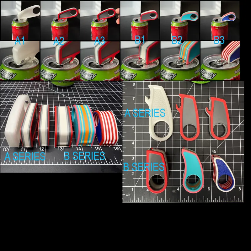
In the image, it’s basically showing a progression. A1 was the first version and seemed too big, so I made A2 and A3. Then I started thinking about the bottle opener issue, which led to B1, and then B2 and B3 are slightly different profiles and sizes from there.
A few things I’m working through:
It should hook onto the tab quickly and naturally.
It should work across different cans, not just one perfect tab setup.
It should be small enough to keep on a keychain or with a can holder.
The large hole is a finger hole, which should help especially for people with long nails.
There is also a smaller keychain hole, even though it is not very visible in the photos.
The print orientation is intentional so the lifting force is handled in a stronger direction instead of relying as much on layer adhesion.
In the image, I have two main directions shown:
A Series
This version is narrower and has more of an exposed hook. It also has a longer reach, so it can lift from the back of the tab while pushing down closer to the front. Mechanically, I think this may be the better setup, and I like the thinner form factor.
The downside is that the exposed hook makes it look a little more like a bottle opener, and that’s not really what I’m trying to make here.
B Series
This version is wider and has a more enclosed tab pocket. It looks less like a bottle opener and feels more clearly dedicated to can tabs.
The tradeoff is that it has to be thicker to capture the width of the tab, and as shown, it may not have quite as much mechanical advantage on stubborn tabs as the A Series.
I’m also considering an unshown C Series, which would basically be a hybrid: more enclosed like B, but with more of the longer reach and mechanical advantage of A- only downside is that it would be bigger- think of A as larger profile but thinner width vs B is smaller profile larger width vs C would be larger profile and width.
So I’m curious what direction people prefer before I keep pushing this further.
Comments (28)
I would absolutely love a flat round one w/ a star or an actual star shape with a hook to go with the flag koozie's. Maybe a special one to go with each special design where we can change the colors accordingly. I would like to attach to the handles and make them a set. My husband and I both are subscribers as we have our own printers and we both think your work is wonderful and appreciate all the time and work you put into all your designs. Thank you for sharing.
I feel that tab openers based off of your themed lids would be popular. I was at a card show this weekend and had some baseball themed tab openers that i was selling. Several people were asking about other sports, specifically golf, football and basketball.
A & B both have pros and cons for them so maybe C which you stated would be a mixture of both styles would be best fit so get best of both worlds or can tabs in this case lol. I love the look of both but A seems more fitting for all hands sizes where B looks bit bigger & bulkier to hold but it is hard to tell exactly from a few little pics. A having the can & bottle opener is the best version when it comes to that part bc then you dont have to promote a can & bottle opener to your customers but people who dont drink the opposite thing might not want both on one tab holder but the convince of having both on one tab holder is def going to appeal to most people who will order them so id prob keep both myself. I like how A is long & slender but B gives more area space to be able to add a logo better. love that they will be keychain versions too. keychains add to the easy convivence appeal for sure. I have many designs that arent even related this stuff that i still add a keychain hole so if they need/want to take it on the go they can just clip it to whatever and go knowing its going to be hanging where they put it and not lost in the bottom of their purse or on the truck floor somewhere lol. cant wait to see what you settle on :)
I like both, I vote A. to ensure I can use for can or bottle.
Why are you only making things related to soda cans?? I guess I thought there was going to be more variety. This is a lot of the same thing over and over with a new spin. Did I miss the part where this was only soda can related?? Not trying to be rude but is an honest observation. You put a lot of emphasis on your credentials and work experience but so far all we have got are drink holders?
This is good feedback and I think it’s pretty accurate but the answer is that the vast majority of people have been requesting can related items and I’ve mainly been following those requests. It’s consumed my time so I hired a designer to help with that but he’s just starting this weekend. I’ll work to get some other designs out.
I'm torn between B and C. Honestly, I am always for something to help those like myself with RA and needing help with simple tasks like this.
I prefer the function of the series B, but flatter. I printed one from another designer for my special needs son, and this kind of style works great for those with difficulty in fine motors.
I think personalization is important to most makers right now, but the clean ones will be a big hit at shows, as they are grab and go items.
Meshy graffiti is an awesome too! I put the Kool-Aid man on the back of one of the red ones.
can these be made using PLA?
yes PLA work fine for use- its just the potential that they get left in the direct sunlight that could be an issue but probably not that likely
The request I have had for them tend to be more around the shape. They want things like bows, paw prints, candy or something that can be customized with initials and such.
B series looks a bit thick but you could go with A series with a solid back instead of a hole with a small slit to open the cans. This way the other side can serve as a can removal like a hook. I've been told by a few ladies with long nails it's difficult to remove the empty can. Pulling if from the tab can break, the edge of the can is sharp, and it's slippery to remove can from the small ring lip.
They look cool, but the openers are about size and convenience. Small, flat style is the most realistic option to carry around.
Really want them to have a logo space
I have metal ones I keep on my keychain. It’s more like style A. B doesn’t look like it will open the tab better, it looks like it might rip the tab more before it opens the mouth hole.
I really like where headed. I have been using some of older traditional ones (ready Key Chain). I think thats the way to go. I do have a request there isn't but one out there for the soda bottle twist off (its kinda clunky) one of these that could combo wit for caps and water bottle caps they are smaller in size and some how be able to go on a keychain would be alsome.
At first sight I thought A was a bottle opener. I do like the thinner option it creates as it would be easier to carry. Option B covering the tab half way like you said would be less useful on stubborn tabs. Option B also poses the risk of objects getting stuck inside it like lint and dust easier.
Do you think it should be like a key chain so people can put it on their keys and they won’t lose it idk just an idea or it’s nothing
One that integrates into the cooler, say maybe hides at the bottom and attaches with magnets.
My initial reaction: A-Series wins mechanically. B-Series wins visually. The question is whether you’re building a tool or an accessory. ⸻ Structural Review Print Orientation Your orientation choice is absolutely correct. The load path is primarily: * Hook pulling upward on tab * Finger applying downward force through body * Tool bending across its length With the layers running front-to-back as shown, you’re putting the stress into continuous strands rather than asking layer adhesion to carry the load. I wouldn’t change that. ⸻ Potential Failure Point The highest stress concentration isn’t the hook. It’s here: * Finger hole * Neck transition * Hook arm That thin waist between the finger ring and hook is where all bending loads are concentrating. I’d actually add a very subtle fillet or thickened rib in that area. Not enough to make it bulky. Just enough to distribute stress. Especially if people print: * PLA * Silk PLA * Old filament Because they’ll eventually snap one there. ⸻ Hook Geometry One thing I noticed: A-series has a more aggressive hook profile. That’s helping self-locate under the tab. B-series relies more on guiding the tab into a pocket. The problem with pockets: People rarely approach perfectly square. Especially: * Elderly users * Arthritis users * Long fingernails The more precision required, the worse the experience. That’s why can openers, door handles, and hand tools all use funnel geometry. ⸻ Operability Review This is where I think A is stronger. A-Series Pros: * Faster engagement * Less aiming required * Better leverage * Works with bent tabs * Works with manufacturing variations Cons: * Looks more like a bottle opener ⸻ B-Series Pros: * Cleaner appearance * More intentional * Feels purpose-built Cons: * Requires more alignment * More material * Less leverage ⸻ Human Behavior Observation Most users won’t actually look at the tool. They’ll feel it. The first time they use it they’ll: 1. Grab tool 2. Slide toward tab 3. Hook 4. Pull Anything that requires visual alignment becomes annoying after the novelty wears off. That makes me lean toward A. ⸻ Cosmetic Review This is where B is stronger. The B-series looks finished. The A-series looks engineered. Those are different things. If I saw A hanging on a keychain: “That’s a tool.” If I saw B: “That’s a product.” Big difference. ⸻ Something I Think You’re Missing The finger hole may be oversized. Not because it’s uncomfortable. Because it’s stealing real estate from the working end. I’d experiment with: * Slightly smaller finger hole * Slightly longer nose Not much. Maybe 10%. That gain gets invested entirely into leverage. ⸻ Keychain Reality This is where I think the design should be optimized. Ask: Would someone actually carry this separately? Probably not. Would someone keep it attached to: * Can koozie * Stanley * Cooler * Lunch bag * Keys Absolutely. Therefore: I would prioritize: * Thickness * Pocketability * Weight over * giant branding surfaces You already reached the same conclusion. The koozie is the billboard. This is the tool. ⸻ Product Differentiation If this were my product line, I’d avoid competing with the flat-logo can openers entirely. Everyone already makes those. I’d market this as: “Low Profile Tab Assist” or “Nail Saver” or “Easy Pull Tab Tool” and emphasize: * Long nails * Arthritis * Weak grip strength * Finger pain * Accessibility Because that’s where your design actually has an advantage. ⸻ My Vote Current Ranking: 🥇 A3 Best balance of size, leverage, and appearance. 🥈 B1 Most professional-looking version. 🥉 B2 Good visual customization opportunities. ⸻ What I’d Prototype Next Not a C-series. I’d build an A4. Take A3 and: * Slightly soften the exposed hook visually * Add a tiny partial shroud around the hook * Increase neck fillet strength * Reduce finger hole ~10% * Add a subtle thumb texture on both sides Basically: 80% A-Series mechanics + 20% B-Series aesthetics I suspect that version would outperform everything shown here. Looking at the progression, I think you’re converging toward the right answer already. The fact that A kept getting smaller while B kept trying to regain leverage tells me the design is naturally pulling you back toward A’s geometry. That’s usually a clue that the mechanics are winning the argument
I would love to find a tab opener that has a slope at the opening to slide easier under the tab into position to open the can. The ones I find are all the same width all the way around it and can be difficult to get under the tab sometimes.
The functional element you describe here is something I put a lot of focus on. THe traditional logo ones look cool but I see so many complaints about them not actually working very well. I'll do a video of the designs I have to show that they are super easy to engage even on the skinny cans which have less room.
They all look great, I like the A series (the thinner ones)
How about incorporating a version in the base of the can coolers
To me that reminds me of the shoe based bottle opener.... would you want to put your mouth on something that is opened by something that has touched every place you sit it down?
My opinion is that they should easily be able to be in your pocket, purse or on a keychain to be readily accessible.