
January 8, 2026
Alright, serious question
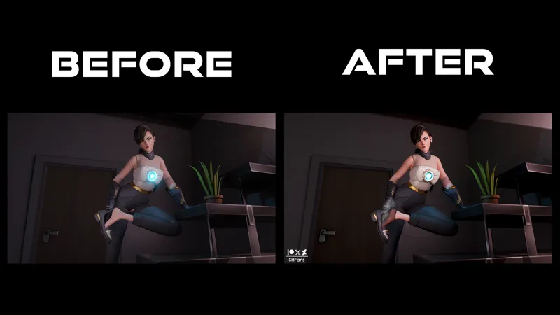
What do you think about the color grading in my comics?
I’m showing you two versions here… and yeah, I know - they look almost the same. Like, “spot the difference” level of the same.
But to me it matters. Mood, skin tone, atmosphere - all that sneaky stuff.
So tell me honestly: Do you notice the difference? Do you like where I’m going with it? Or am I just overthinking it like a true artist? 😅
Comments (1)
K
Keendalsis · January 9, 2026
Nah I see it, right has a bit more contrast and less dull looking so aint going crazy. Think a little bit of it can help, just as long as like skins and ambient light doesnt steer too far red or green saturated etc