
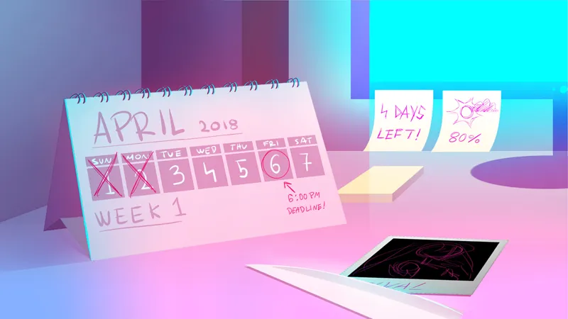


Day 2: Calendar Concepts
The purpose of any screen in a video game is to communicate information, and I believe that the current iteration of the Calendar screen communicates exactly what it needs to. However, I've often wondered if there might be any good ways to spruce it up and make it look a bit more interesting and thematically appropriate. To that end, I have occasionally asked concept artists to submit concepts for how the Calendar screen could be improved or re-designed.
In this post, you'll see some mockups of new looks for the Calendar screen. At this point in time, updating the Calendar screen is not a very high priority, but I would still be interested in hearing your thoughts on these designs!
Comments (12)
I love the last one !
I love the first one it’s very realistic and a QoL improvement 😍😍😍
I really enjoy the last one
I love the first and sixth one, honestly!
Hey Yan-Dev! have you ever thought of making a tiktok account? it would be a good way to share some updates in a short video.
I'm sorry, but I have a very low opinion of TikTok. From what I have seen, there is too much abuse/bullying/harassment on that platform, and the site's owners make no attempt to do anything about it. I wouldn't want to try posting on that platform.
My favorites are the third and fourth ones personally. I think the simplicity is charming and clean-looking :D
Not sure about the font but I think the last one is the best! Not super busy like the first but not too plain like the others.
Love the first one!
i Love the first and last ones!!! the first one really has that "teenage room" vibe, whilst also giving the player all the info they need! and i really like the animation idea, it really sets the scene for any new players of how much hatred ayano has towards the rivals, although i suppose it could get a little tiring watching the same animation for 7 days, so maybe just have it at the beginning of each week??
I love this first one. It's so much better. and I have never seen anything like it before!! If you ever plan on changing it. Let the fans vote. i'm pretty sure that one would win. It's amazing.
That first zoomed out design looks really cool especially if each well it slightly changed like the title screen does when you eliminate the current Rival