
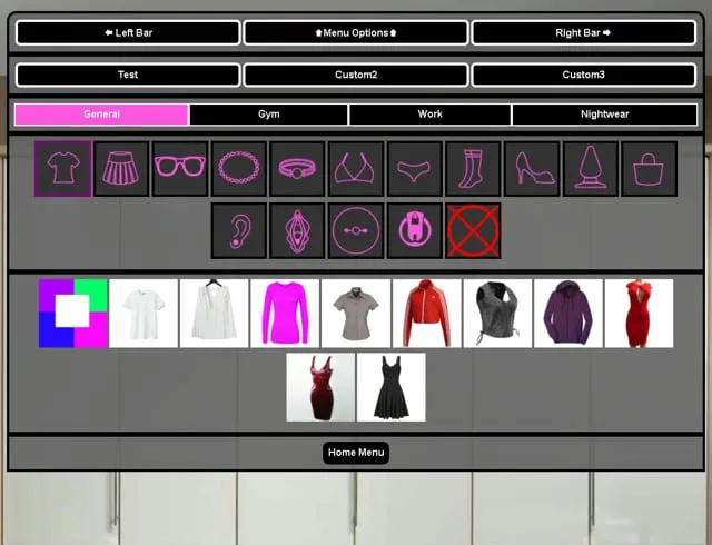
Wardrobe Upgrades
I've been tweaking the wardrobe from time to time, as I'm still not happy with it, and this is what I've come up with. I'd LOVE some input, as I'm not some fancy graphic designer. So if you have any ideas, let me know.
Comments (9)
The colour picker doesn't make sense without clicking on it a bunch of times to figure out it's a cycle. I'd make it a basic colour wheel with a curved arrow about a quarter of a turn over the wheel.
Feels more organized like that.
That's the goal!
It looks nice. So far there are no special proposals for modernizing the wardrobe, but if they appear, I will definitely let you know ...
Looks good to me! :)
That looks pretty good. One thing I would definitely change if it were me though is how to choose clothing colours. Instead of the button to cycle through them I'd have another row under the clothing items with coloured buttons, for the colours the current clothing item can be. That would be much more user-friendly.
Well, different outfits have different color schemes, they don't always use the same pattern. So a toggle "wheel" of sorts is really the most efficient way to do it. That is unless I want to go through and manually code a selection for every single clothing item... Which I don't.
Been a while since I played this game, but still support it. However I just tried out the newest version and it feels much more complex and difficult to get into these days. I feel it lacks the intuitive and simple setup that it had before.
That's mostly a result of more content. Everything used to be right there on the main screen. But when you have 8 classes, 4 work options, 6 people with more on the way, and all the stuff you can do at home. You have to sacrifice a slight ease of access in order to make room on the screen for all that stuff.