


One simple concept that guides my color choices
The most important tool we have as miniature painters is color.
Well maybe color and models.
Every project ultimately comes down to two things: what you’re painting, and which colors you choose. So let's talk a bit about color.
There’s no shortage of good resources on color theory. But translating theory into practical decisions - which paints to pick, where to place them, and how they work together is much more tricky - partly because it's very subjective.
So today, I want to share one simple but powerful concept I use all the time: framing.
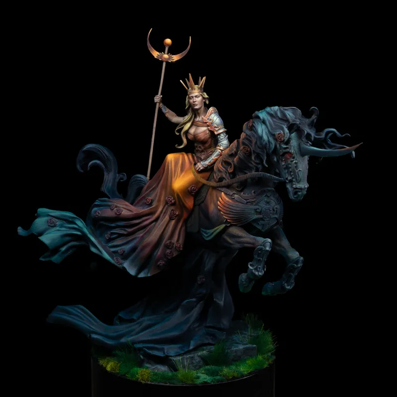
To explain it, let’s look at my latest project Lady of the Black Rose, an alternative box art I painted for Aradia Miniatures.
From the start, I knew I wanted a very clear focal point on the rider, with a dramatic sense of lighting. I achieved that by letting large parts of the model stay dark and quiet so the important areas could be bright and demanding.
Despite how complex the piece may look, the color palette is actually very restrained.
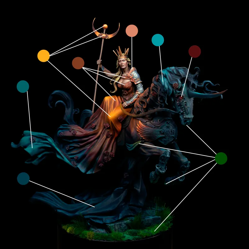
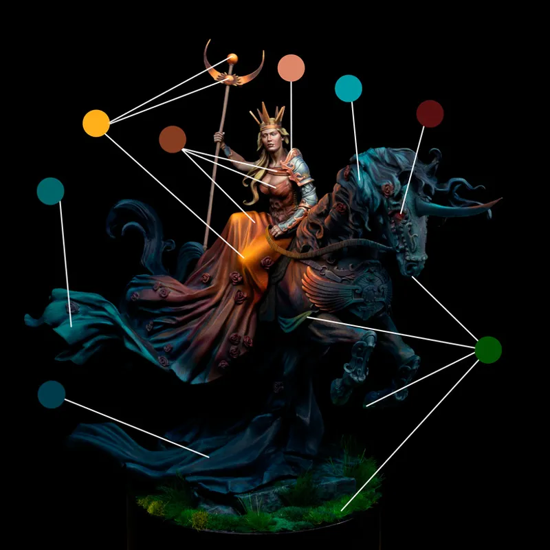
We’re really only working with orange, red, turquoise, and green.
At first glance, this might feel chaotic - but notice how few colors are actually present.
If we look at saturation:
The orange is by far the most saturated
Then the turquoise
With red and green sitting at roughly the same, lower level
Once we start looking at where these colors are placed, the logic becomes clearer.
Because I wanted the rider to be the focal point, the metallic elements closest to her - her crown and arm armor were given a salmon-copper tone. When you connect those elements visually, they form a shape that frames her face and torso.
The same thing happens with the highly saturated orange. When you trace those areas, you’ll see that they also surround and point toward the rider’s upper body.
By placing the most attention-grabbing colors around the face rather than on everything equally, the eye is naturally guided to where it matters most.
The red then acts as a transition. It runs from the horn tip to the horse’s eyes, into the roses and dress. It covers a larger area but at a lower saturation - helping the eye move gently from the intense orange into the cooler turquoise.
The green, on the other hand, stays well away from the red. Since those colors contrast strongly, I didn’t want them competing for attention. So the green is kept to the base and the undersides - areas that aren’t meant to pull focus.
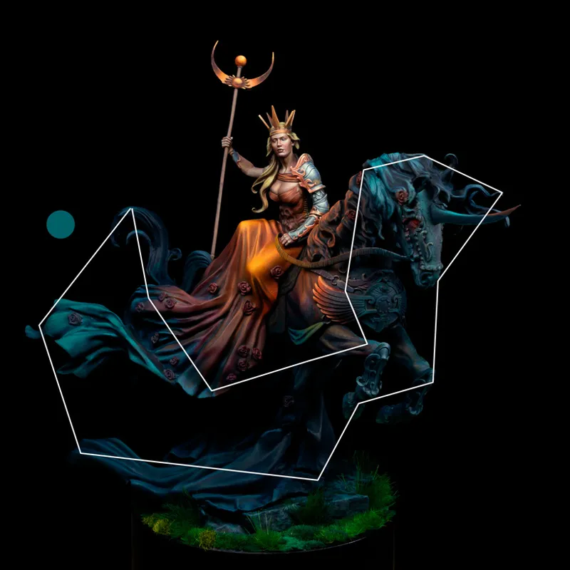
Finally, we have the turquoise frame.
It covers the largest area of the model and has the lowest contrast. Its job is simple: to act as a calm border around the warmer, more intense colors - supporting them without fighting them.
That’s framing.
It’s about creating color shapes that border important areas, guiding the viewer’s eye and reinforcing a clear focal point.
This approach is often easiest to see in larger projects like this one, but the same idea works just as well on smaller figures.
So the next time you’re choosing colors, try asking yourself:
Where do I want the viewer to look first?
Which parts of this figure are important?
Which parts are allowed to stay quiet?
If we give every area the same level of contrast and attention, we often lose readability even if each individual section is painted well.
Leaving large parts of a miniature dark and low-contrast takes a bit of artistic bravery. It requires commitment to a vision. But it’s often what makes a piece read clearly from across the table.
I’ll be talking much more about this in the upcoming video lessons on this project. For now, I hope this breakdown gives you a useful way to think about color and a practical tool you can apply to your next paint job.
If you're in Denmark - be sure to check out my
Upcoming Workshop
If you’d like to explore painting in depth with me, check out my workshop:
The Wobbly Nerdles, Randers – NMM & Atmosphere
March 14-15, 2026
This is a small group weekend workshop where we dive deep into technique, but also into the way painting can carry mood and create an emotional impact. Due to a family emergency, I've had to move the workshop to these new dates in march. There's still tickets available!
I hope to see some of you there!
Warm regards,
Malte
Comments (1)
Amazing read, I have so much to learn